The visual component of the written word is typography. Typography sets the mood of the content. Good typography introduces positive vibes and delivers a delightful experience to users.
Readability vs Legibility
Readability refers to the way in which words and blocks of type are arranged on a page, and is dependent upon how the typeface is used. Key factors include: line length, kerning, tracking, alignment and leading.
Legibility — how well one individual character can be distinguished from another — is an informal measure of how easy it is to tell letters apart. Key factors include: point size, font style, x-height, character shape and whether the face is serif or sans serif.
Typography Creates Brand Recognition
When a company is developing a brand identity, a consistent set of fonts should be used — each with a particular reason. Typography helps brands remain in the minds of users. Choosing the wrong font can completely change the personality of your brand.
Choosing the right typography increases the readability of content and the associated actions. In order to use typography effectively, we must anticipate how the use of fonts and styling will influence customers or audience, even in ways they are not consciously aware of initially.
Serif or Sans Serif?
Both styles have their own unique personality and communicate very different messages. For projects involving lengthy text — such as magazines, books and newspapers — serif typefaces are the most commonly used typestyle. There are many exceptions, but that is the most common usage.
The general recommendation is that sans serif is best for web, but the choice is also based on other considerations such as branding or the mood communicated by a particular typographical style.
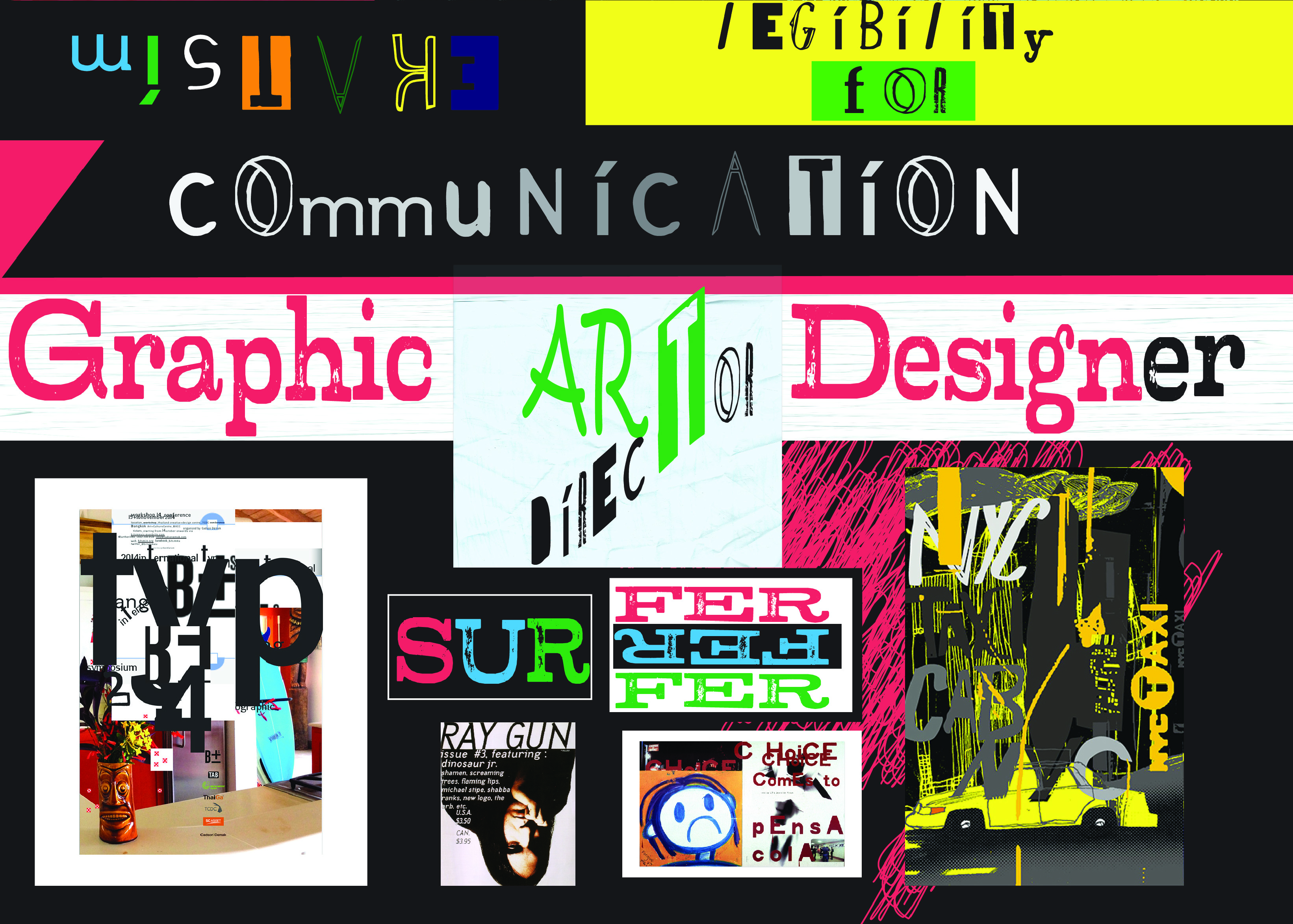
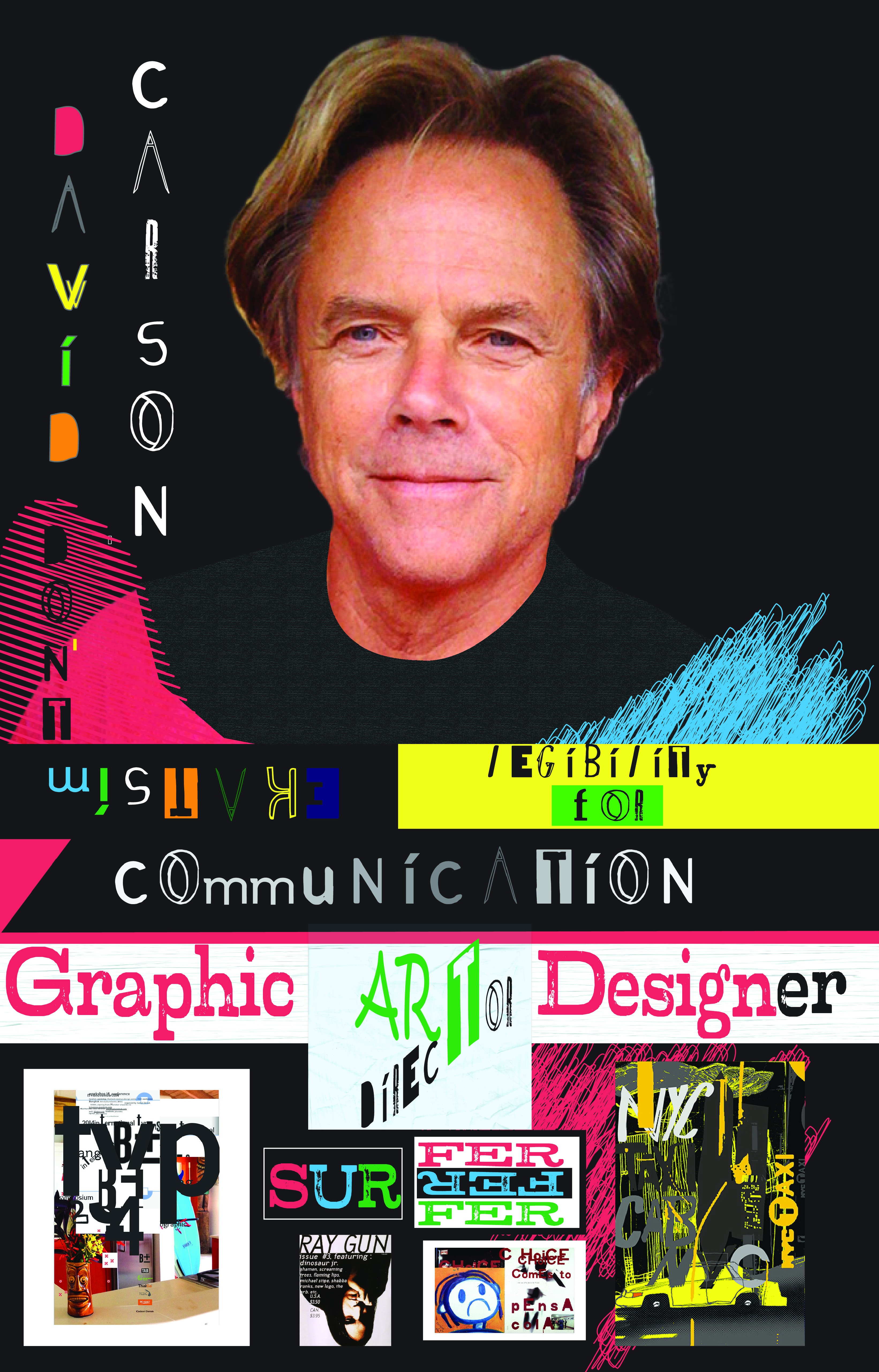
"Don't mistake legibility for communication." — David Carson
Typography in Motion Graphics
In motion graphics, typography takes on an additional dimension — time. Kinetic type must be legible during its animation, readable at its hold position, and expressive throughout its movement. The principles of static typography — hierarchy, contrast, spacing — all apply, but must be considered in the context of motion, pacing and screen environment.